


Idea bar listing page
Whether or not you are a Pokémon player, the packaging on the Vmax Dragons collection might inspire anyone with an eye for design to buy this
Read MORE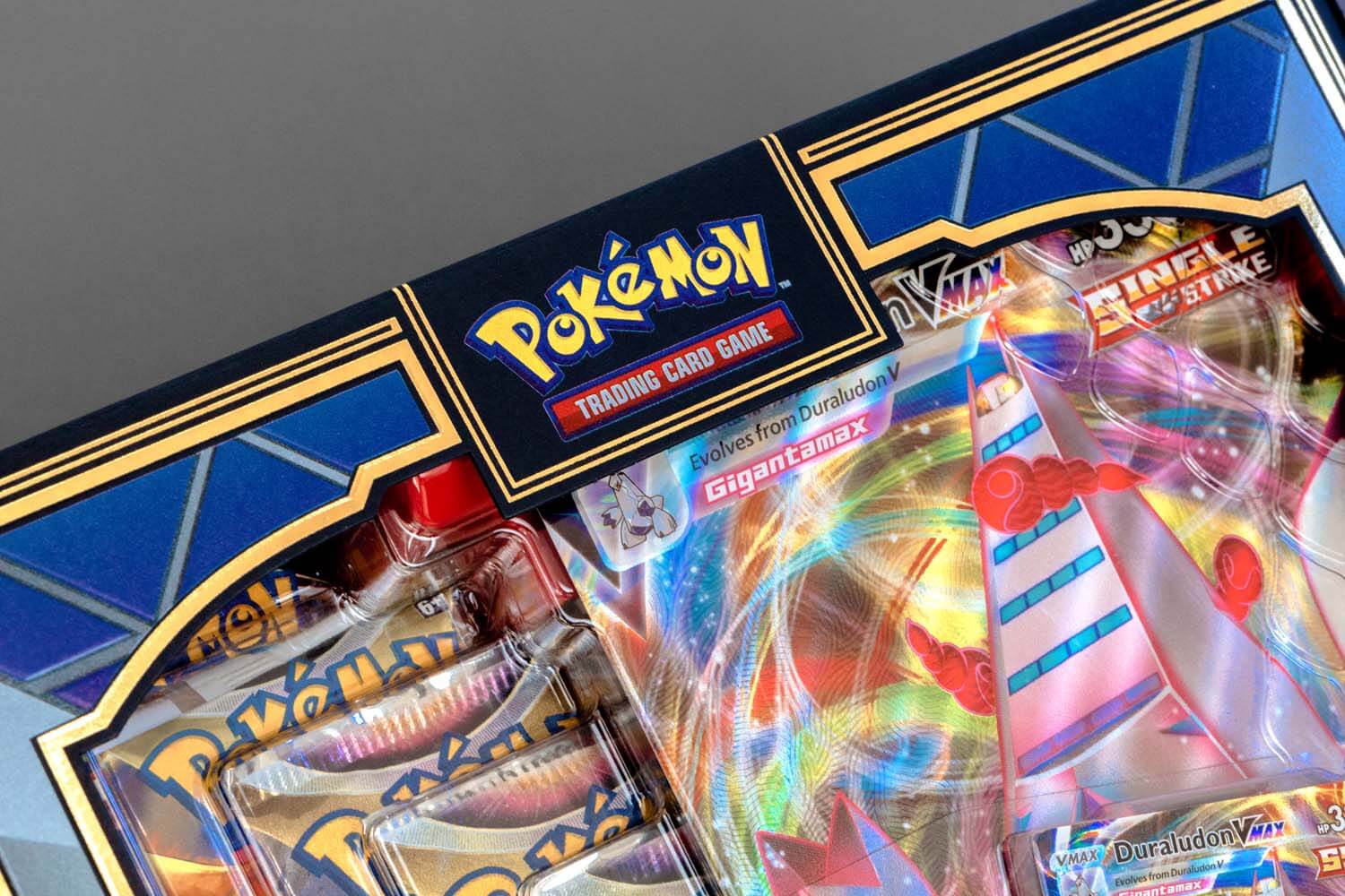
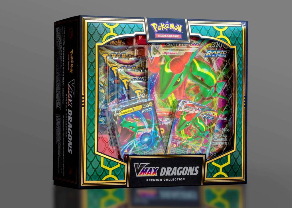
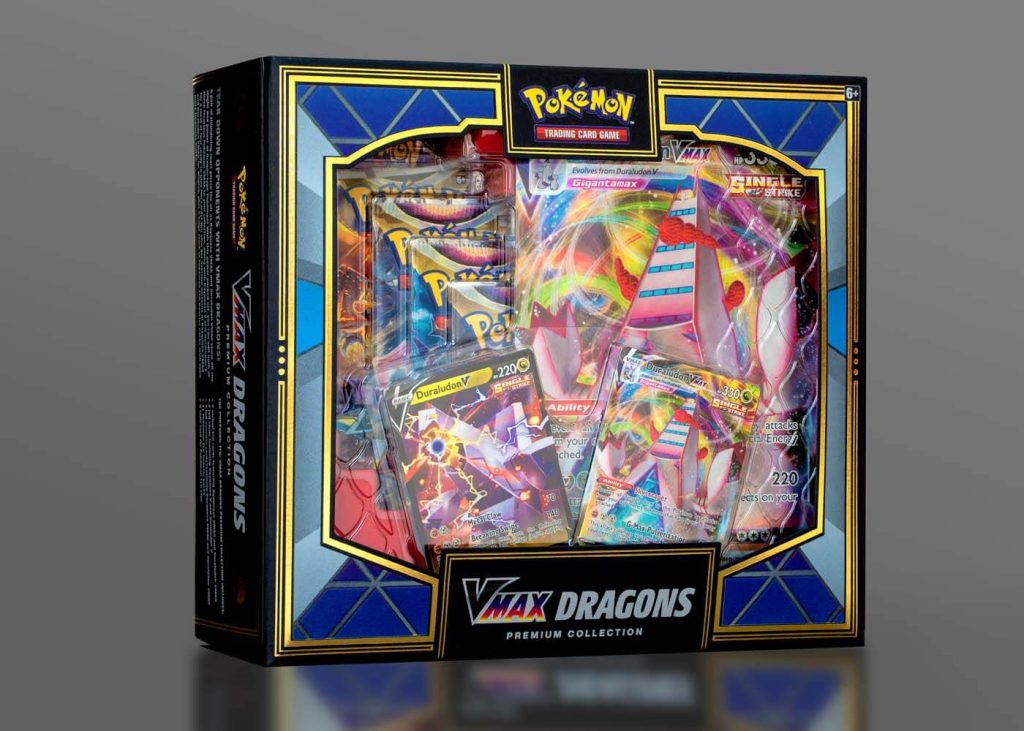
Whether or not you are a Pokémon player, the packaging on the Vmax Dragons collection might inspire anyone with an eye for design to buy this set. It is stunningly sophisticated with a hefty dose of eye candy that pulls you in at first sight.
The design team at Pokémon faced the challenge of creating a piece that would showcase the contents – in this case, 2 different versions of the game – in one box. Being that it is a retail item, considerations like fitting on shelf were high on the priority list. This is where the “double-sided” concept was conceived.
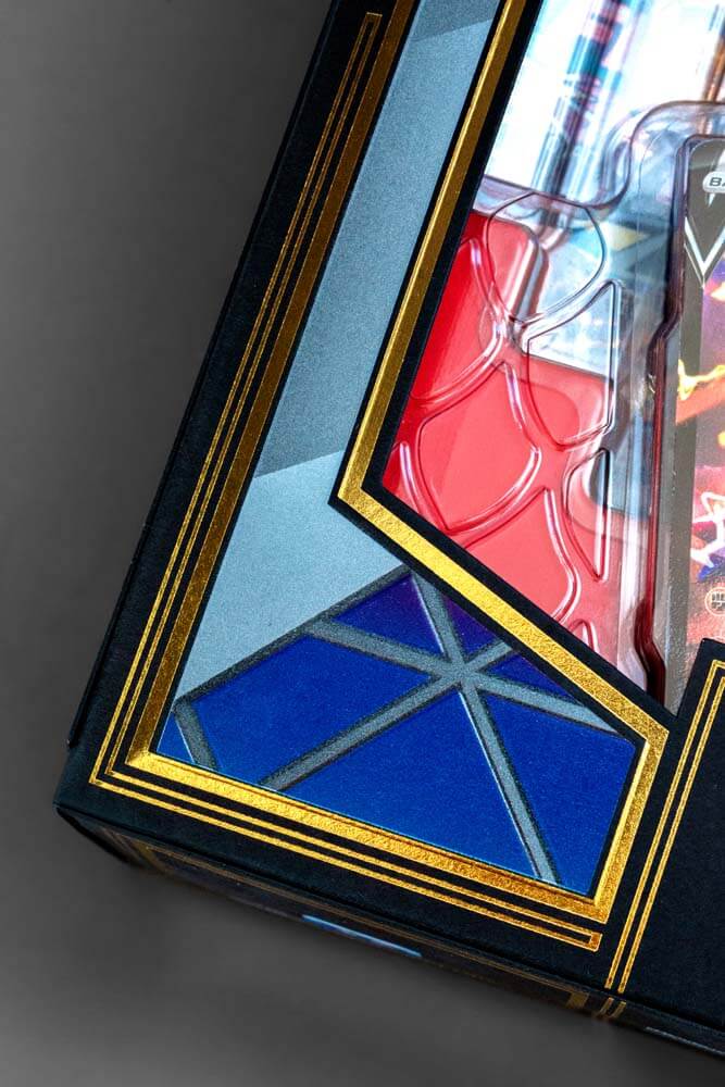
To further investigate this idea, the team enlisted the help of CMI Plastics to design the thermoform. Thermoforming is a manufacturing process where a plastic sheet is heated to a pliable forming temperature, then formed to a specific shape. The challenge was to design something that would showcase the elements of both games, while remaining stable inside the outer carton, which would have large, open sides allowing clear visibility of the product. CMI came up with a brilliant design of interlocking thermoform trays. This allowed the box to retain a modest footprint while still displaying all the components through the diecut window to the consumer. The red base tray and dragon scale textures on the thermoform lid were crowing achievements.

Next up, the carton. The design team at Pokémon had been gradually experimenting with uncoated stock in things such as rulebooks, brochures, and other text and cover weight materials. But not really for a box set. When the idea of using an uncoated, deep black folding board was considered, the designer could envision the potential. It would be the perfect backdrop to highlight some of the colorful elements of the game, while adding some drama to the overall look.
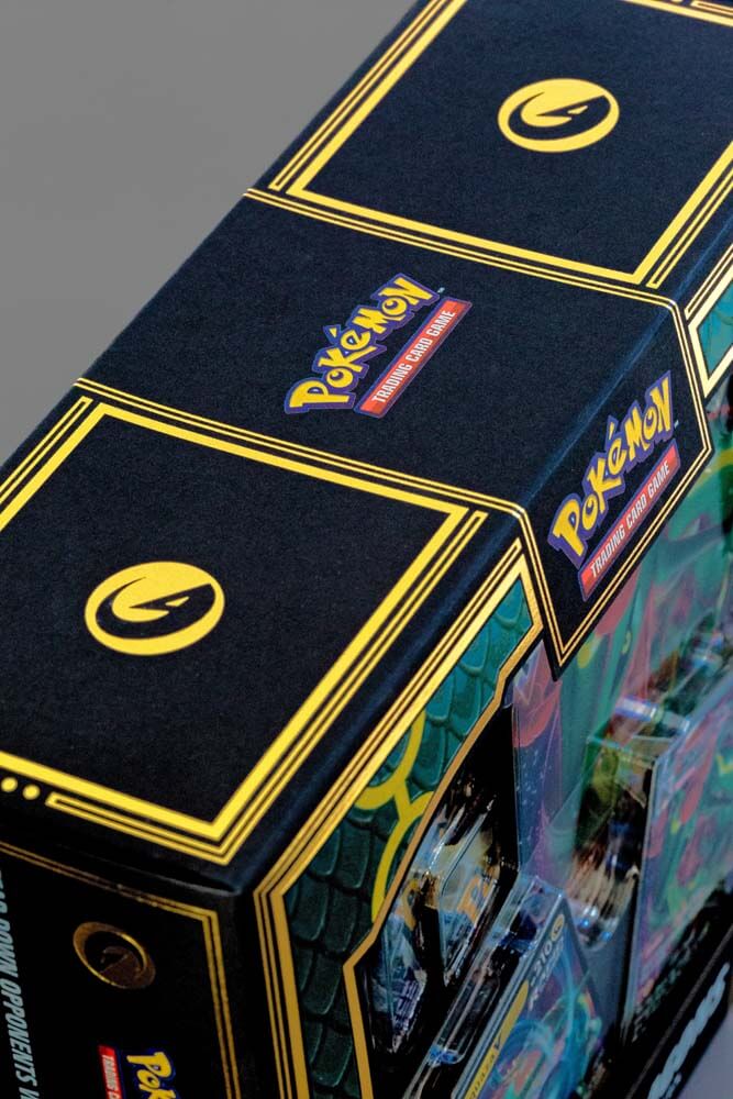
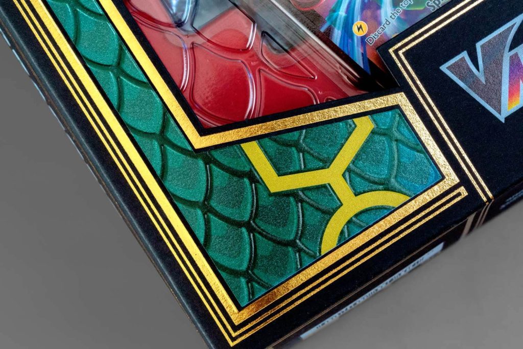
The box was printed at Dreamworks Graphic Communications on Neenah Folding Board, Deep Black, Vellum Finish. The image area on the box was first printed with 2 hits of UV white, then UV four color process. The addition of a spot UV pearlescent coating on the dragon scales along with a registered emboss was a way to add pop and dimension! Finally, a hot gold foil stamp was utilized throughout the design to really pull it together.
We think the end result is pretty cool. Almost too beautiful to open!
The beauty and personal care industry is responsible for creating over 120 billion plastic packaging units annually, and only about 9% of that is
Read MOREThe beauty and personal care industry is responsible for creating over 120 billion plastic packaging units annually, and only about 9% of that is recycled. Grove Collaborative® knows the products you use are effective because of what’s in the bottle, not the plastic bottle itself. Peach Not Plastic™ includes a collection of 100% plastic-free shampoo and conditioner bars, made with 100% natural fragrance, packaged in 100% post-consumer FSC® certified folding board. Each bar can last for over 100 washes and replace up to two or three plastic bottles each. Go to link
Grove Collaborative has made a commitment to be plastic-free by 2025! In addition, every purchase of Peach Not Plastic supports the 5 Gyres Institute, their non-profit partner dedicated to reducing plastic pollution globally.
Peach Not Plastic is a game-changer. Consumer attitudes toward plastic packaging have changed, and the spotlight is on companies, like Grove Collaborative, who can evolve to meet sustainable expectations.
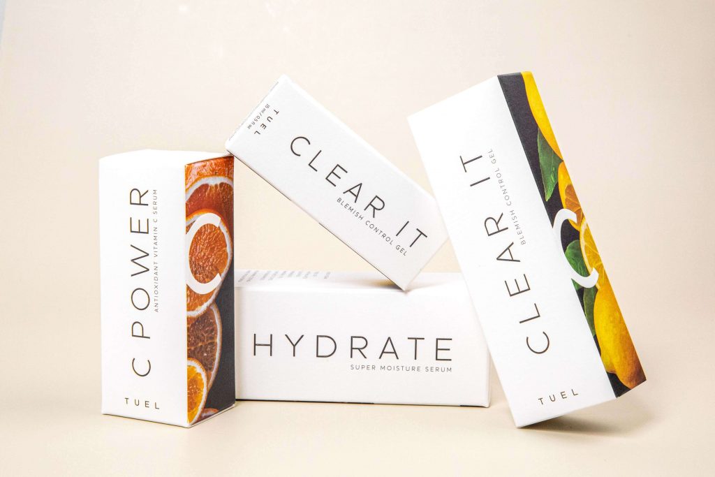
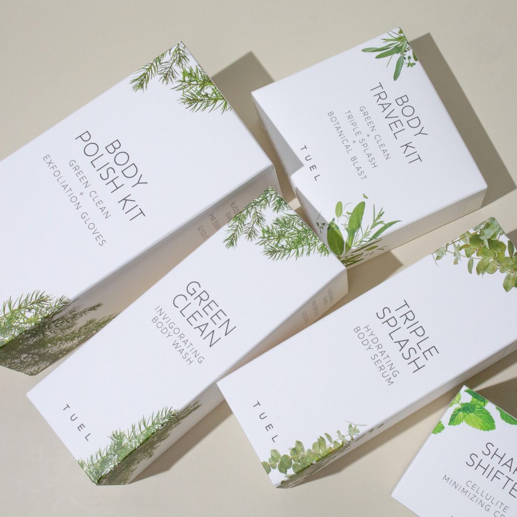
First created for skincare professionals, Tuel has been helping keep skin vibrant and healthy since 1979 using the most powerful plant extracts
Read MOREFirst created for skincare professionals, Tuel has been helping keep skin vibrant and healthy since 1979 using the most powerful plant extracts the planet has to offer—active botanicals and minerals rich in potent antioxidants and vitamins that feed skin from the outside in. But telling that story from the shelf can be a challenge. We spoke with Tuel Skincare co-owner, Lisa, one half of the sister-led company, to learn more about the heart and science in each package and how Neenah has helped communicate their all-natural brand promise.
Neenah: You’ve revolutionized the modern skincare industry with your focus on plant extracts and skin science. But your mom was a real pioneer in the industry decades ago. Tell us about her journey.
Lisa: Our mom was a true entrepreneur at heart. She became interested in botanical skincare products in 1980 and set out on a mission to create a professional skincare line that would work for every age, ethnicity, gender, and condition. This business went from a four-chair salon in the 1970s to where we are today because of her relentless focus on helping customers understand why the products they used mattered. We learned through example. Watching our mother succeed and grow her business was so inspirational, and we just naturally carried on that passion and drive.
Neenah: What role does your packaging play in communicating your brand’s message?
Lisa: For beauty products, the packaging is how you make your first impression. You can tell so much about what’s inside based on how the box feels when you pick it up. What’s the texture? How thick is the box? Our design is thoughtful but minimal, with stunning photography highlighting our natural ingredients. Each photo is a work of art on its own! Our packaging encapsulates everything our products stand for – natural, clean beauty. Our products aren’t just based on passing trends; neither is our packaging.
Neenah: Why Neenah?
Lisa: We’ve been using Neenah for over a decade. We wanted to highlight our focus on sustainable, natural products with paper that had an organic feel. Neenah has several whites and different finishes and the Bright White, Eggshell Finish is perfectly neutral as well as tactile. The paper performs perfectly, photographs beautifully, and feels luxe. We also made a conscious decision to go with thicker, heavier basis weights. Most companies use 18pt for smaller boxes, but Neenah’s 24pt is perfect. Our jars are heavy, and the heavy paper not only performs but also feels premium.
Neenah: Where do you see the industry going?
Lisa: Science is coming back to the beauty industry. Products today are more science-driven because cosmetic chemistry has really developed, and newer ingredients have come to the forefront. But while there’s always room for improvement, clean formulations and targeted skincare are fundamental.
Neenah: What drives you to keep evolving and innovating?
Lisa: Our passion will always be the same. Our niche is education and not driven by gender or color–it’s the size of your pores and how to treat your skin. Like my mom, we’re still focused on helping women be financially successful. We offer advanced classes and on-site training to make sure our professional customers are educated on the products. We also teach them how to run their business, which is really unique.
Over the last two years, we’ve adapted to consumer behavior and social distancing changes by helping our wholesalers get creative. We did a lot of Instagram live and put together home spa kits for our clients to keep their skincare up when they couldn’t come for services. We’ve seen a lot of success by being able to pivot. These tactics have become a regular part of our ongoing education and have helped us build a stronger connection with our customers.
Packaging a Promise
The role of packaging in building trust between brand and consumer is enormous. Even after customers have done their research, read glowing reviews, and gotten recommendations for your product, it’s the first tangible impression you make as a brand. The right packaging paper isn’t just an element of design. It’s a crucial touchpoint that reflects what your customers can expect from your brand.
a Mativ Brand
