


Idea bar listing page
Hello Bartlett Brands! Tell us a little about yourselves. We are an all-female creative innovation agency that develops and launches
Read MORE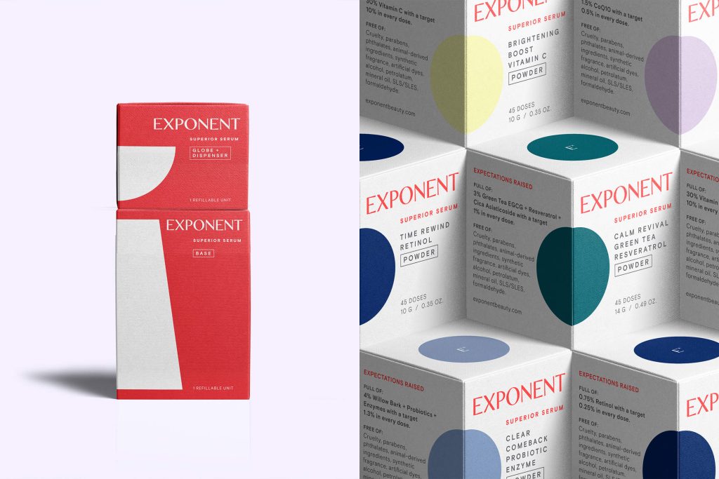
Hello Bartlett Brands! Tell us a little about yourselves.
We are an all-female creative innovation agency that develops and launches forward-thinking, culturally-relevant consumer brands. We challenge the status and cut through the quo with smart strategy, stylish storytelling, and sustainable design. Often, we create something from nothing.
NEENAH: Challenging the status and cutting through the quo. We love that! And sustainable design always gets our attention. Perusing through some of your work, we’ve noticed a fair amount is in beauty – is that your specialty?
Because we have several beauty industry vets on the team, we often find ourselves working in parallel categories like health & wellness and personal care—often with brands and products targeted towards women. We are dedicated to banishing outdated narratives, stale marketing clichés, and cultural taboos as it relates to these evolving categories. And we love to work with any consumer brands that want to be at the forefront of sustainable innovation.
NEENAH: Do you typically work with start-ups or established brands?
We work with mostly early-stage companies prior to launch—as well as some established brands in need of a radical refresh. Generally, our clients are at a financial inflection point, either they have just raised their first round and are ready to invest in branding—or they have traction and need fine-tuning to get to the next level.
NEENAH: The Exponent primary packaging is such a unique and innovative idea! At what stage in the project did Exponent come to you for help?
We were involved in the beginning. The team came to us with their incredible product and initial packaging ideas. In addition to conducting consumer research, brand strategy, brand naming, identity, and storytelling—we have worked tirelessly on the packaging approach and design. Newness and innovation are very challenging for consumers. We also did all the copywriting, web design, photography, video, and some digital marketing.
NEENAH: Did you have any input in the primary packaging, or was that already established?
Yes, we worked alongside the industrial designers at Tomorrow Lab and the manufacturers at Wormser Group to perfect and evolve the primary packaging system, both functionally and aesthetically. Our patented Activator Packaging System was a huge lift in form, function, and sustainability. We worked on it over the course of 3 years to get it right.
NEENAH: Can you explain how it works?
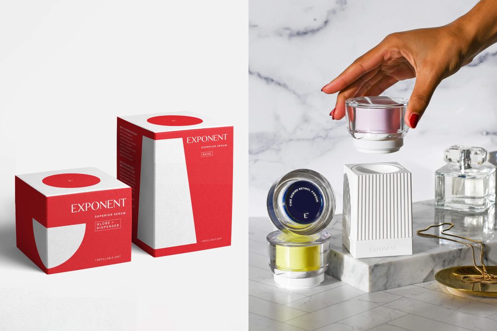
Functionally, the Activator is essentially a sexy dispenser that works like a lock & key: You place the Powder Globe onto the Hydrator Base and simultaneously push in while you twist. This action precisely doses the optimal amount of Active Powder from the top Globe while up-pumping the Hydrator from the Base. The consumer mixes for about 8 seconds before applying. The precision dosing of powders is no easy task– it’s usually done with single-use disposable packaging solutions in the pharma industry. There are 22 components in our Activator and Exponent holds utility and design patents on it.
NEENAH: That is fascinating! It sounds so mechanical, yet it looks so beautiful.
For deco and form, we knew that beyond being functional packaging, we wanted to bring beauty and luxury into the packaging design. We drew inspiration from the vintage fragrance bottles our Founder remembered seeing on her grandmother, Elsie’s, boudoir. Our white column-like fluted Hydrator Base has an almost sculptural quality while our Lucite Globes and Powder Dispensers illuminate and refract the bold, color palette of our various Active Powder Jars.
NEENAH: What was the most challenging part of this branding project?
As designers and innovators, it is our responsibility to make the most sustainable decisions when creating new and complex packaging. There were two main challenges to tackle with this new innovative design. 1. Appealing to consumers in a way that made it easy to change their typical skincare behavior, and 2. Creating a streamlined refillable packaging system that minimizes materials & landfill waste—without adding complexity or compromising product performance.
NEENAH: How important was it to incorporate sustainability into this project?
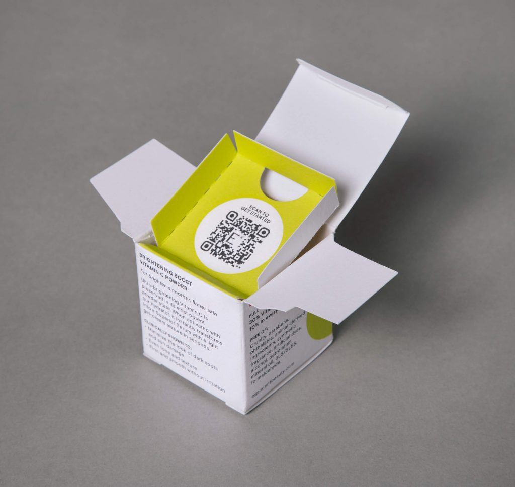
It was a priority from the start! One of our goals was to eliminate plastic waste, which led to the invention of a refillable system. Our system is designed to be reused over and over, while our Powder and Hydrator Refills come in infinitely recyclable glass with aluminum caps. In addition, our unit cartons are made from 100% post-consumer waste papers. For its achievement in eliminating plastic waste, Exponent achieved B Corp certification prior to launch.
NEENAH: When it came to the carton design, were you looking specifically for 100% post-consumer waste?
Sustainability is extremely important to us as an agency – we’ve been thought-leaders on the topic since before it was trendy—which is why we always challenge our brands to make the best choices. Exponent didn’t need any convincing, we were aligned from the start that the brand is luxury with a conscience, and we loved the sophisticated look of the NEENAH® Folding Board. We’ve long been admirers of Neenah paper and were excited when our printer partner presented it as an option.
NEENAH: The packaging for the base and globe + dispenser have a different look than the refills. Explain the color decisions.
The Base and the Globe + Dispenser pieces are meant to be used over and over again, so we distinguished them with a flood of red. The product refills have a flood of white with pops of color that speak to product benefits.
NEENAH: How is the product selling?
Exponent Beauty launched about a year ago and has quickly become a cult breakout brand surpassing revenue expectations. It has grown rapidly through organic acquisition, with extensive press coverage, social UGC, rave customer reviews, and unusually strong repeat purchases.
NEENAH: Can you attribute sales success to branding and packaging?
We think so! Exponent customers and press editors have given glowing testimonials, speaking to the dramatic results they experience, as well as the counter-worthy design and sustainability measures.
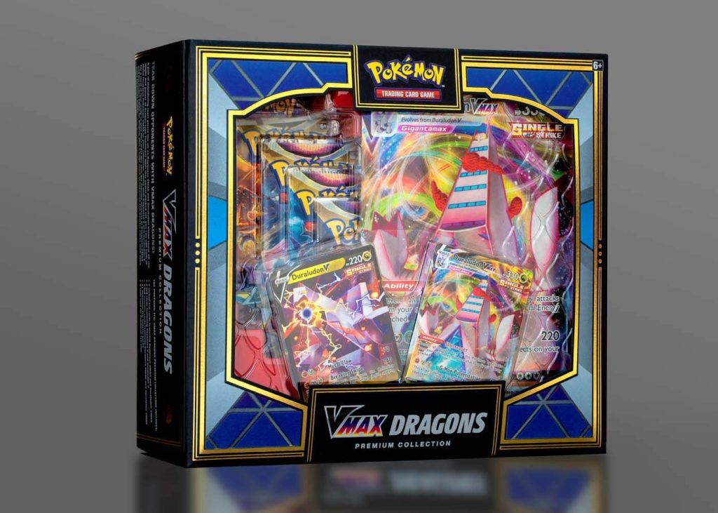
Whether or not you are a Pokémon player, the packaging on the Vmax Dragons collection might inspire anyone with an eye for design to buy this
Read MORE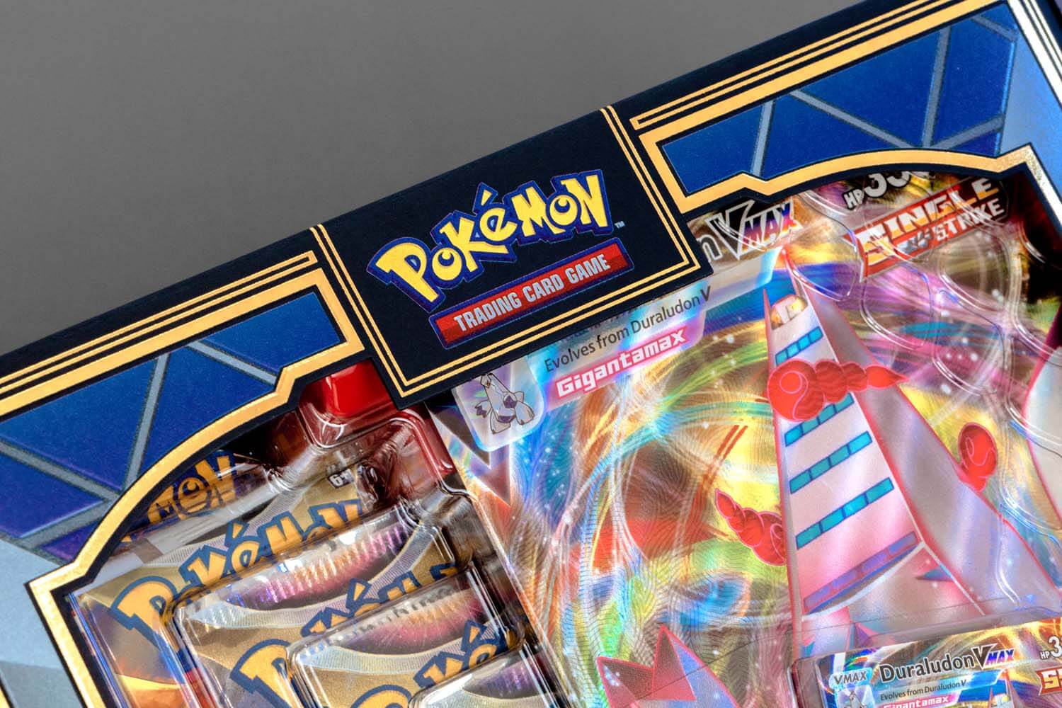
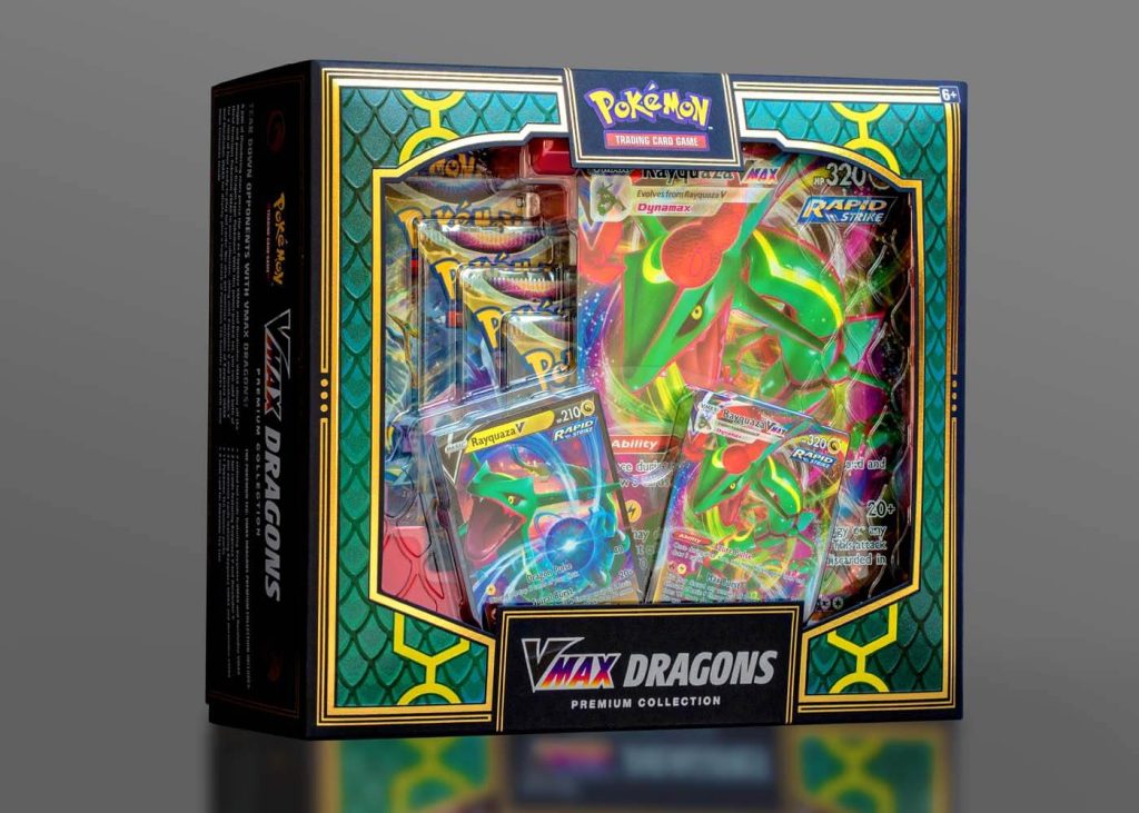
Whether or not you are a Pokémon player, the packaging on the Vmax Dragons collection might inspire anyone with an eye for design to buy this set. It is stunningly sophisticated with a hefty dose of eye candy that pulls you in at first sight.
The design team at Pokémon faced the challenge of creating a piece that would showcase the contents – in this case, 2 different versions of the game – in one box. Being that it is a retail item, considerations like fitting on shelf were high on the priority list. This is where the “double-sided” concept was conceived.
To further investigate this idea, the team enlisted the help of CMI Plastics to design the thermoform. Thermoforming is a manufacturing process where a plastic sheet is heated to a pliable forming temperature, then formed to a specific shape. The challenge was to design something that would showcase the elements of both games, while remaining stable inside the outer carton, which would have large, open sides allowing clear visibility of the product. CMI came up with a brilliant design of interlocking thermoform trays. This allowed the box to retain a modest footprint while still displaying all the components through the diecut window to the consumer. The red base tray and dragon scale textures on the thermoform lid were crowing achievements.
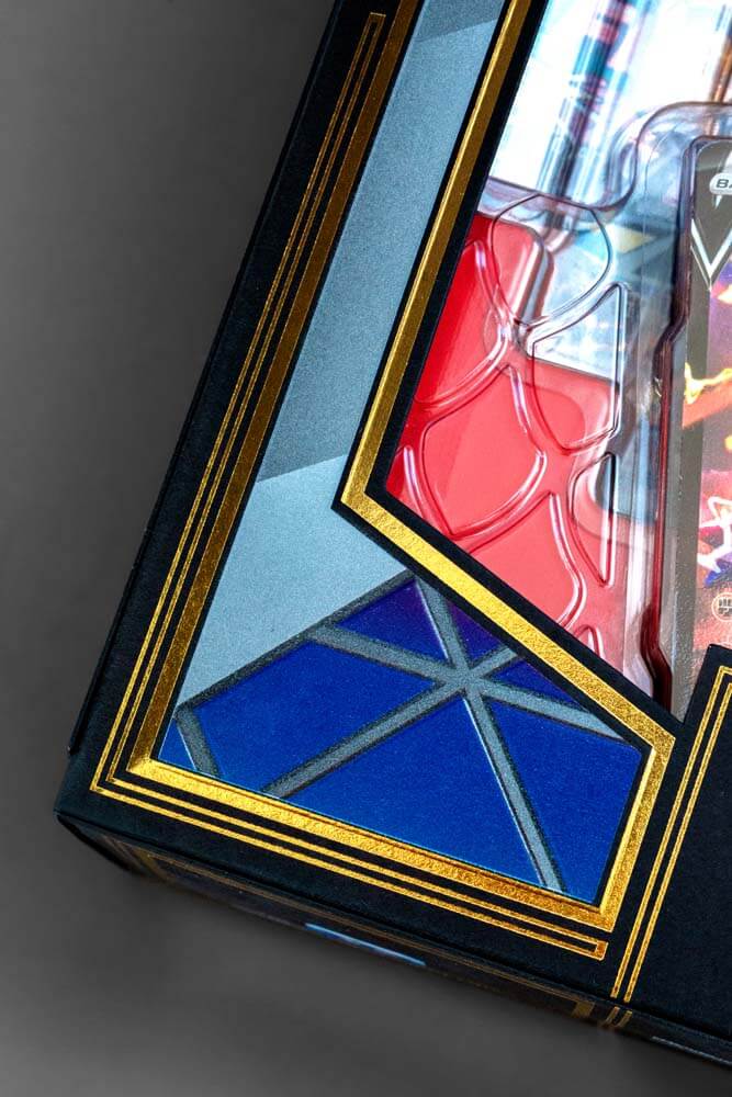

Next up, the carton. The design team at Pokémon had been gradually experimenting with uncoated stock in things such as rulebooks, brochures, and other text and cover weight materials. But not really for a box set. When the idea of using an uncoated, deep black folding board was considered, the designer could envision the potential. It would be the perfect backdrop to highlight some of the colorful elements of the game, while adding some drama to the overall look.
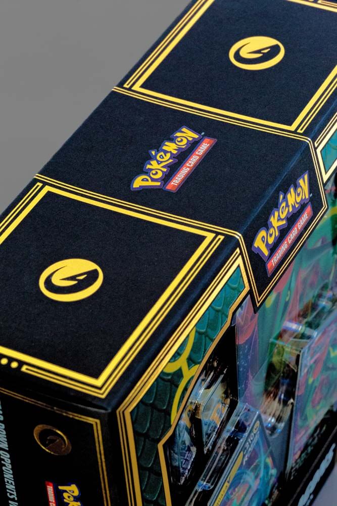
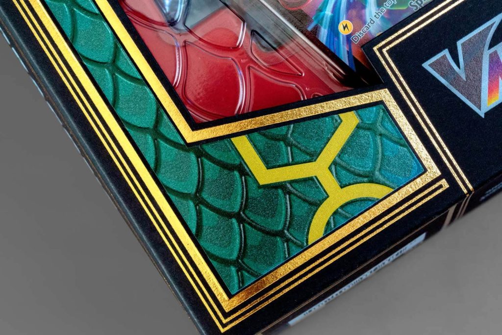
The box was printed at Dreamworks Graphic Communications on Neenah Folding Board, Deep Black, Vellum Finish. The image area on the box was first printed with 2 hits of UV white, then UV four color process. The addition of a spot UV pearlescent coating on the dragon scales along with a registered emboss was a way to add pop and dimension! Finally, a hot gold foil stamp was utilized throughout the design to really pull it together.
We think the end result is pretty cool. Almost too beautiful to open!
The beauty and personal care industry is responsible for creating over 120 billion plastic packaging units annually, and only about 9% of that is
Read MOREThe beauty and personal care industry is responsible for creating over 120 billion plastic packaging units annually, and only about 9% of that is recycled. Grove Collaborative® knows the products you use are effective because of what’s in the bottle, not the plastic bottle itself. Peach Not Plastic™ includes a collection of 100% plastic-free shampoo and conditioner bars, made with 100% natural fragrance, packaged in 100% post-consumer FSC® certified folding board. Each bar can last for over 100 washes and replace up to two or three plastic bottles each. Go to link
Grove Collaborative has made a commitment to be plastic-free by 2025! In addition, every purchase of Peach Not Plastic supports the 5 Gyres Institute, their non-profit partner dedicated to reducing plastic pollution globally.
Peach Not Plastic is a game-changer. Consumer attitudes toward plastic packaging have changed, and the spotlight is on companies, like Grove Collaborative, who can evolve to meet sustainable expectations.
a Mativ Brand
