


Idea bar listing page
Whether or not you are a Pokémon player, the packaging on the Vmax Dragons collection might inspire anyone with an eye for design to buy this
Read MORE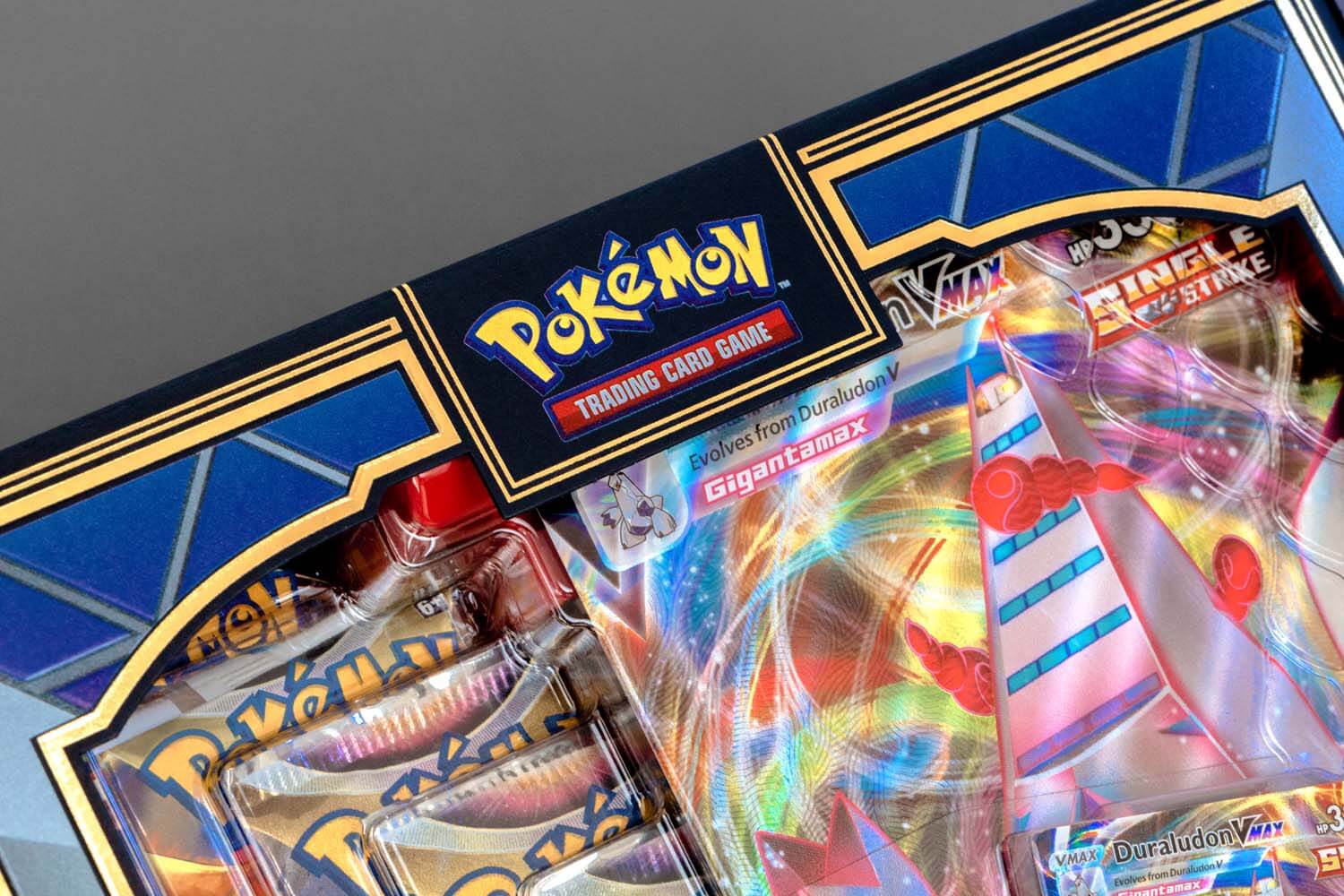
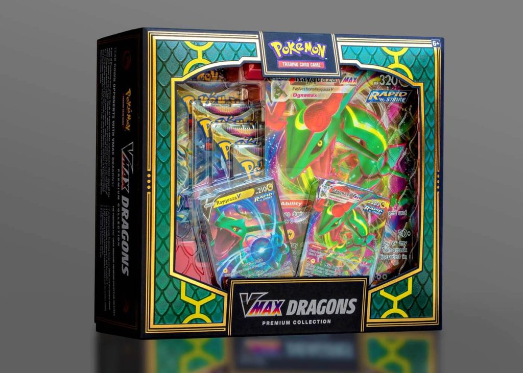
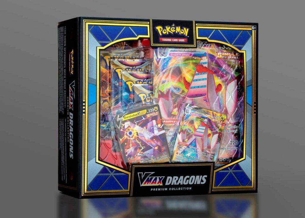
Whether or not you are a Pokémon player, the packaging on the Vmax Dragons collection might inspire anyone with an eye for design to buy this set. It is stunningly sophisticated with a hefty dose of eye candy that pulls you in at first sight.
The design team at Pokémon faced the challenge of creating a piece that would showcase the contents – in this case, 2 different versions of the game – in one box. Being that it is a retail item, considerations like fitting on shelf were high on the priority list. This is where the “double-sided” concept was conceived.
To further investigate this idea, the team enlisted the help of CMI Plastics to design the thermoform. Thermoforming is a manufacturing process where a plastic sheet is heated to a pliable forming temperature, then formed to a specific shape. The challenge was to design something that would showcase the elements of both games, while remaining stable inside the outer carton, which would have large, open sides allowing clear visibility of the product. CMI came up with a brilliant design of interlocking thermoform trays. This allowed the box to retain a modest footprint while still displaying all the components through the diecut window to the consumer. The red base tray and dragon scale textures on the thermoform lid were crowing achievements.
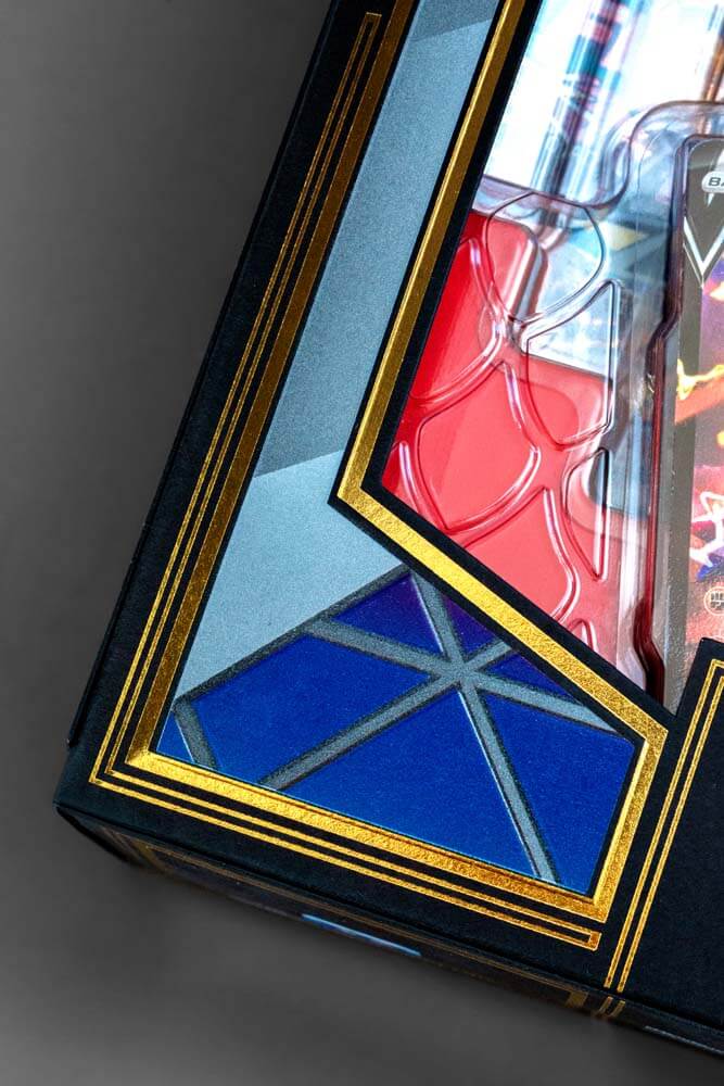

Next up, the carton. The design team at Pokémon had been gradually experimenting with uncoated stock in things such as rulebooks, brochures, and other text and cover weight materials. But not really for a box set. When the idea of using an uncoated, deep black folding board was considered, the designer could envision the potential. It would be the perfect backdrop to highlight some of the colorful elements of the game, while adding some drama to the overall look.
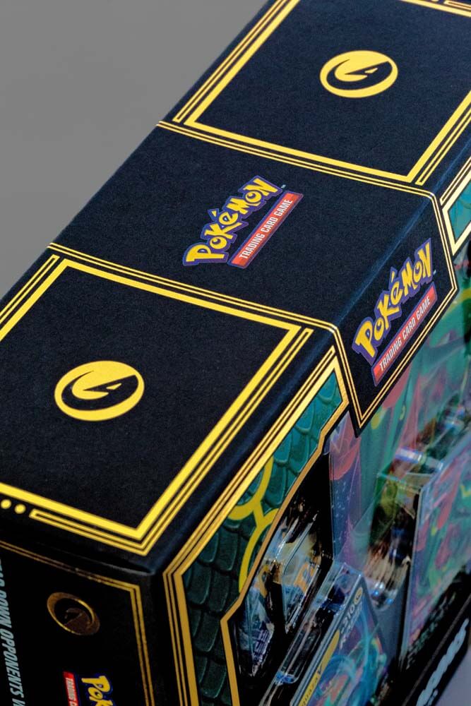
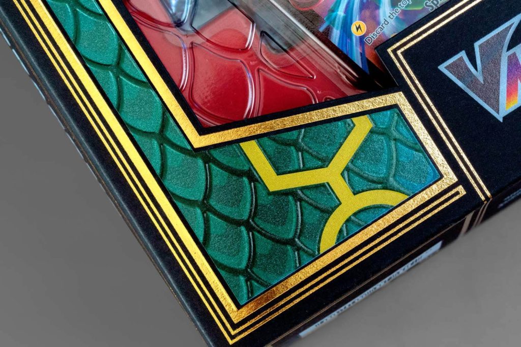
The box was printed at Dreamworks Graphic Communications on Neenah Folding Board, Deep Black, Vellum Finish. The image area on the box was first printed with 2 hits of UV white, then UV four color process. The addition of a spot UV pearlescent coating on the dragon scales along with a registered emboss was a way to add pop and dimension! Finally, a hot gold foil stamp was utilized throughout the design to really pull it together.
We think the end result is pretty cool. Almost too beautiful to open!
</br> Color is constantly evolving. Responding to culture, design, and the way people want to express themselves. As we move into 2026,
Read MORE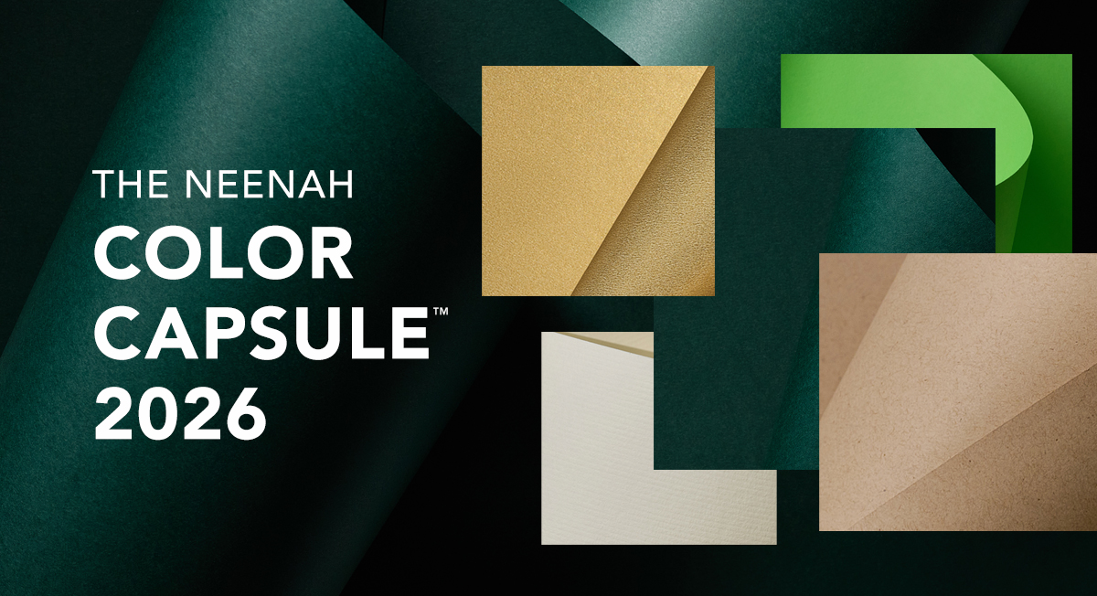
</br>Color is constantly evolving. Responding to culture, design, and the way people want to express themselves. As we move into 2026, that evolution brings a renewed sense of lightness, warmth, and optimism.
Last year’s palette embraced depth and richness. This year, designers are leaning toward hues that feel fresh, uplifting, and naturally grounded. Across different facets of design, we’re seeing a rise in warmer neutrals, expressive greens, and tones that pair creativity with a sense of calm. Sustainability remains central, guiding choices toward colors that feel authentic, timeless, and versatile.
The shift isn’t about leaving something behind, it’s about opening up new possibilities. It’s about color that inspires expression, invites clarity, and creates space for both personality and responsibility.
Introducing the NEENAH COLOR CAPSULE™ 2026
</br>
A curated collection that brings warmth, freshness, and modern sophistication to print design.
</br>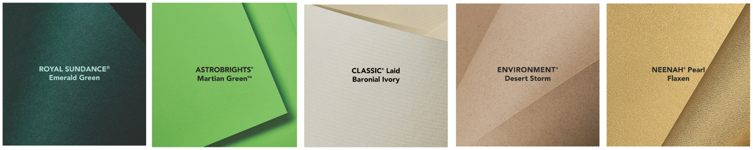
</br>FIVE COLORS. MULTIPLE FINISHES. INFINITE POSSIBILITIES
</br>Bright, warm, and inviting, the 2026 palette sparks creativity with expressive greens, cozy neutrals, and balanced, uplifting tones. Sustainable, versatile, and timeless, these colors invite thoughtful design, giving your print more presence.
</br>Start here and build the foundation for impactful print.
</br>ROYAL SUNDANCE® Emerald Green
A deep, balanced green that connects timeless elegance with the grounding calm of nature. Sophisticated, steady, and beautifully versatile.
</br>ASTROBRIGHTS® Martian Green
Bright, crisp, and optimistic, this energetic green brings a modern edge and a playful burst of freshness.
</br>CLASSIC® Laid Baronial Ivory
A warm, creamy white that softens and elevates. Its subtle shade is a perfect alternative to white, and pairs effortlessly with both bold accents and gentle neutrals.
</br>ENVIRONMENT® Desert Storm
A dependable, understated neutral that signals sustainability without sacrificing style. A natural foundation for building thoughtful color stories.
</br>NEENAH® Pearl Flaxen
A soft, golden hue that brings quiet glamour. Polished yet approachable, Flaxen adds a touch of sparkle, with warmth and a refined radiance.
</br>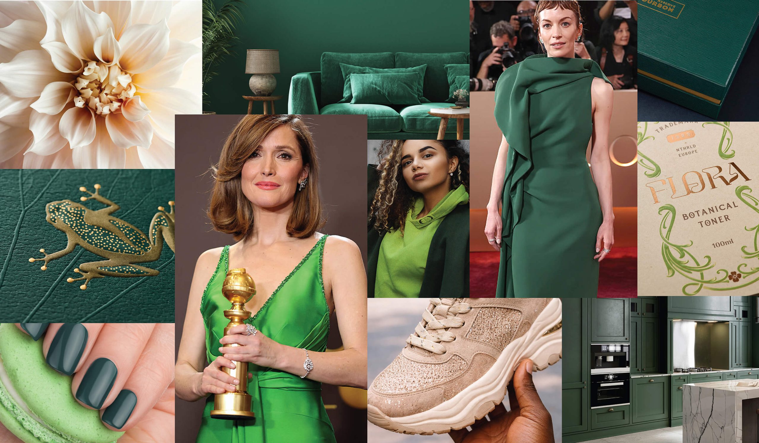
There’s little doubt that sustainability has become an integral part of the consumer experience in today’s culture. In fact, recent
Read MORE
There’s little doubt that sustainability has become an integral part of the consumer experience in today’s culture. In fact, recent studies show that positive consumer attitude toward environmentally friendly products and services has evolved quickly in recent years, and it’s here to stay.
According to Trivium Packaging’s 2021 Global Buying Green Report, two-thirds of consumers consider it essential that the products they buy are in recyclable packaging. More than half take sustainable packaging into consideration when selecting a product. Let that sink in.
Consumers indicate that it is no longer enough to offer a desirable and natural product; it must also align with consumer sentiment and values to be successful. Suppose brand purpose and environmental viewpoints now surpass cost and convenience for shoppers. In that case, it’s time for you to think about how to recycle everything possible, including product packaging.
WHAT HAPPENS WHEN THE UNBOXING MOMENT IS OVER?
In a recent study for Beauty Packaging, 51% of respondents defined paper-based packaging materials as sustainable if the finished product is recyclable. In other words, all of the features of the packaging must be able to be recycled. Thus, a new challenge. How do you create an incredible unboxing experience from a recyclable package?
It all starts with design. There are a dizzying number of choices regarding a package’s end of life and the components that lead to that moment. Can you right-size or use less packaging for your product? If you ship it in a smaller package, will your customer still feel special? Are there beautiful, tactile substrates with environmental certifications? What printing techniques add extra oomph without adding waste to the recycling stream?
The great news is that there are more ways than ever for your package to stand out proudly as a sustainable extension of your brand. Advancements in eco-printing techniques, substrate development, and even the recycling process make meeting your goals more achievable than you might think. So, brands today can design without much restraint in adding signature details that create memorable engagements.
RETHINK INK AND TECHNIQUE
Imagine your product wrapped up in a luxurious uncoated substrate, imprinted with attention-getting foil stamping, or perfectly printed with minimal messaging in metallic ink. Is it still recyclable? This is where it gets confusing for the consumer.
There are known misconceptions about the recyclability of metallic decorated paper and board, but The Foil and Specialty Effects Association (FSEA) experts set out on a mission to debunk those ideas. In 2020, they completed a study with GA Tech to educate others on how hot foil, cold foil, and digital transfer techniques are safe and sustainable to use without fear of compromising the recycling process.
They confirmed that when decorating your carton or label using the appropriate transfer method, the transferred aluminum is turned into fine particles and washed away from the fibers during repulping. Meaning, it is feasible to repulp the metallic foil decorated papers as it is done in typical recycling settings.
Foil transfers are not to be confused with foil lamination, which is a different process that is challenging to recycle or repulp and is not generally considered sustainable. Be sure to work with a reputable printer that knows the difference.
Jeff Peterson, Executive Director for FSEA, offers advice. “If you’re looking at decorating your carton or label with metallic embellishment, do your research and understand the application process. FSEA advocates for foil transfers as your most environmentally friendly option.”
ONCE THE INK DRIES
Let’s talk about ink on paper. Will traditional dye-based, soy-based, pigment-based, or metallic inks on paper affect recyclability? The short answer is no. When processed during recycling, packaging papers are de-inked. The fibers are cleaned of ink, ready to be made into new substrates.
According to Scott Gasch, President of Fey Printing, “The printing industry has really made tremendous strides in accepting accountability for more sustainable ways to produce printed materials. Sky’s the limit in paper-based packaging. I tell my clients asking about sustainable printing; once the ink is dry, it becomes part of the packaging. If you’re working with the right printing partner, they can coach you through every moment from paper choice to production.”
CUTTING EDGE SUBSTRATES WITH SUSTAINABLE STYLE
The perfect packaging often starts with substrate choice. To ensure that you are creating a package that walks the talk, you’ll want to dig deeper into the sourcing of your substrate. Start by looking for uncoated products made from renewable or recyclable materials that come from sustainable sources. Look for substrates where 100% of the fibers consumed are from FSC-certified forests, recycled materials, or other controlled sources.
For an alternative to recycling, consider paper-based packaging that is also compostable. NEENAH® Folding Board now offers three folding board products in 18pt Bright White, Natural White, and PC100 White that are industrial compostable.
When you’re ready to order, think about right-sizing your sheet. Take advantage of low minimum order quantities for custom sheet sizes, giving you maximum yield and minimum waste for your specific project; you could remove approximately 30% of paper waste in some circumstances.
DESIGN WITH PAPER IN MIND
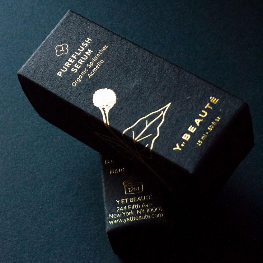
More brands in emerging markets such as CBD, Craft Beverage, and Beauty let the substrate do the heavy lifting, visually communicating the brand’s sustainable values. An example would be using light or natural colored uncoated folding board paired with minimal ink or embellishments. Or choosing bold paper colors like black or charcoal topped with a simple design, appealing to consumers’ senses and inviting touch.
The Y et Beaute brand’s stunning packaging features CLASSIC CREST® Epic Black in Eggshell finish with clean foil-stamped messaging. The result? Must-touch packaging, standing out on shelf and oozing with luxury. All without compromising sustainability goals.
“I felt like we got the best of both worlds: luxury and sustainability. The packaging came from all recycled materials, and the samples were so beautifully done,” says Y et Beaute founder Esther Sutjiawan.
The bottom line, you can create a beautiful, recyclable package that complements your brand and values while standing up for the environment. Do your research, choose wisely, and win.
<br> Youth to the People is redefining skincare with products rooted in their mission to create a positive impact across the globe. With a
Read MORE<br>Youth to the People is redefining skincare with products rooted in their mission to create a positive impact across the globe. With a firm belief in the power of science and a commitment to helping people thrive, YTTP harnesses superfood ingredients to deliver results and build confidence.
To celebrate the launch of their new Superfruit Gentle Exfoliating Cleanser, they turned to Hatteras to create something truly unforgettable.
So, how do you generate buzz around a new product from an already well-established brand? You get people talking—and what better way to do that than with an influencer kit? The beauty of an influencer kit lies in its ability to surprise and delight. After all, who doesn’t love the thrill of a great unboxing experience?
The team at Hatteras delivered with a show-stopping design that combined thoughtful engineering and stunning visuals. The box was carefully crafted to cradle the product securely while showcasing it as the star of the show. Protection was key, but the unboxing journey was just as important.
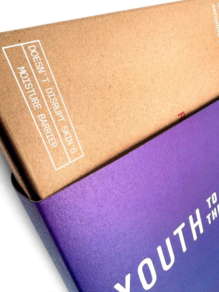
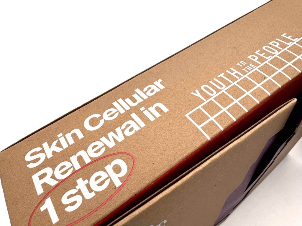
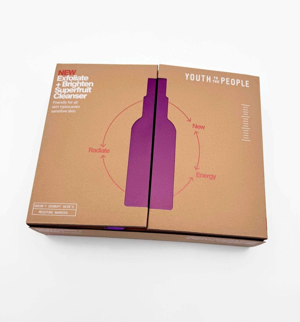
<br>Starting with a vibrant purple belly band, recipients are drawn into the experience. Removing the band reveals an innovative “open-door” style box with a sleek die-cut shape, hinting at the product inside. The cleanser itself, made with papaya, features a gorgeous orange hue that inspired the design’s central theme. Paired with a complementary purple palette and printed on NEENAH® Folding Board Grocer Kraft, the result is a striking contrast that feels bold, modern, and premium.
YTTP is an admirable leader in sustainable practices. “We Have One Planet To Protect” is a core brand pillar and it guides every thing they do. Their formulas are vegan, cruelty-free and housed in refillable or reusable glass as often as possible. Secondary packaging is made with papers containing post-consumer waste, and fully recyclable. Grocer Kraft from Neenah is the perfect choice to fit the sustainability need as well as the vibe of the company.
Color is back! And we're here for it. <br> Color has always been a subject of passion and debate. It has the power to evoke
Read MORE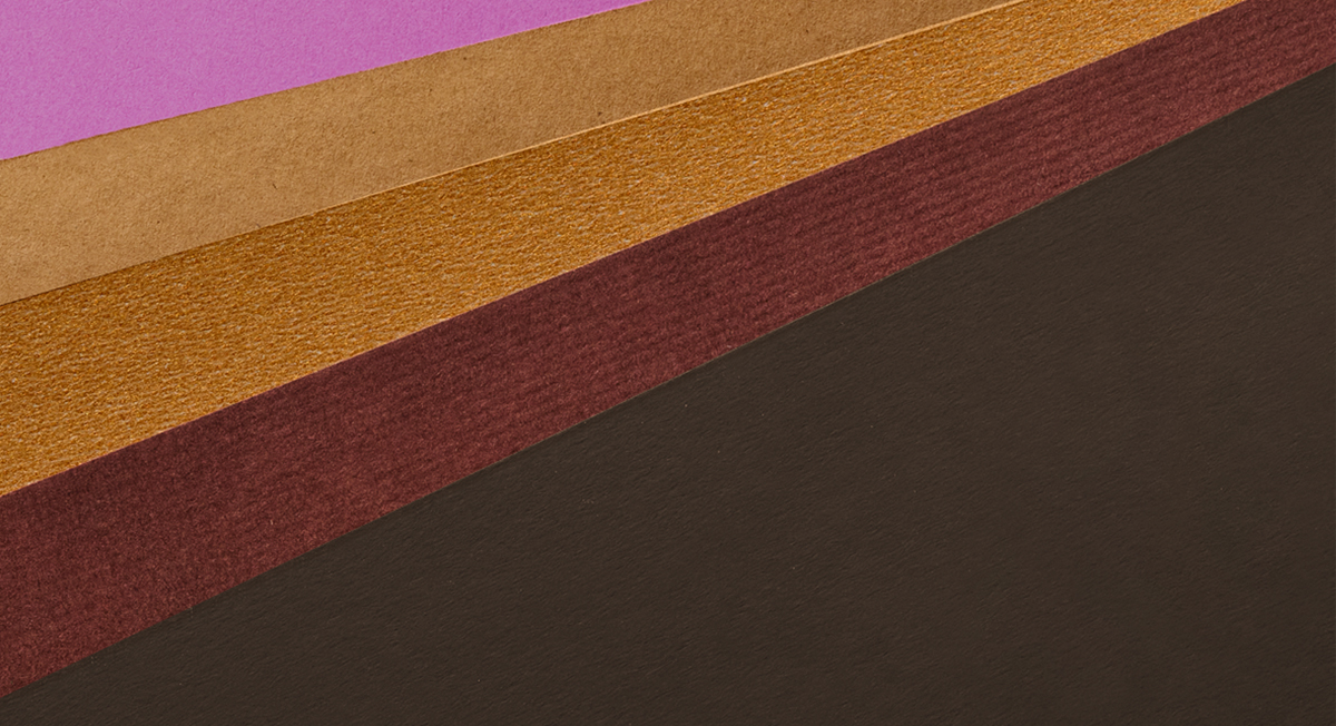
Color is back! And we’re here for it.
<br>Color has always been a subject of passion and debate. It has the power to evoke emotion, shape perceptions, and set the tone for design. While trends may shift, one thing remains constant: the influence of color is undeniable. Design and color trends evolve hand in hand, shaping the creative landscape with every shift.
In recent years, we saw minimalism dominate, with soft neutral palettes, understated typography, and an abundance of white space. These trends spoke to a desire for simplicity and clarity. But the pendulum is swinging. Designers and brands are now embracing a bolder approach: richer colors, dynamic typography, and layered textures are making their way back into the creative toolbox.
As we step into 2025, the design world is radiating with rich, saturated warm tones—hues that exude comfort, intensity, and sophistication. Earth tones, a natural extension of the sustainability movement, continue to hold their place, but the palette is evolving. Warm ambers, deep crimsons, and golden hues are taking center stage, offering a sense of balance between modern energy and timeless elegance.
At Neenah, we believe color and texture have the power to elevate print projects into something truly unforgettable. That’s why we’re thrilled to announce The Neenah Color Capsule 2025, a curated collection of five premium text and cover papers that celebrate this bold new era of design.
The Palette: 5 Papers, Endless Possibilities
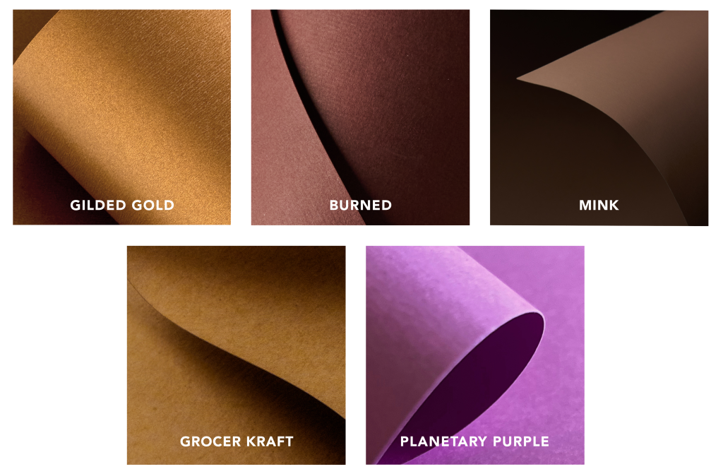
NEENAH® Pearl, Gilded Gold: A deep golden hue with subtle shimmer, ideal for adding a touch of elegance and sophistication.
OXFORD® Burned: A timeless, woven texture paired with a rich, classic hue that bridges tradition and trend.
TOUCHÉ Mink: A deep, velvety texture paired with a rich, warm tone that conveys understated luxury.
NEENAH® Folding Board, Grocer Kraft: A warm earthy hue, coupled with the organic, RAW® finish, perfect for grounding any project with a sense of natural authenticity.
ASTROBRIGHTS® Planetary Purple: A bold, saturated tone designed to energize and inspire bold ideas.
Why Designers Will Love It
<br>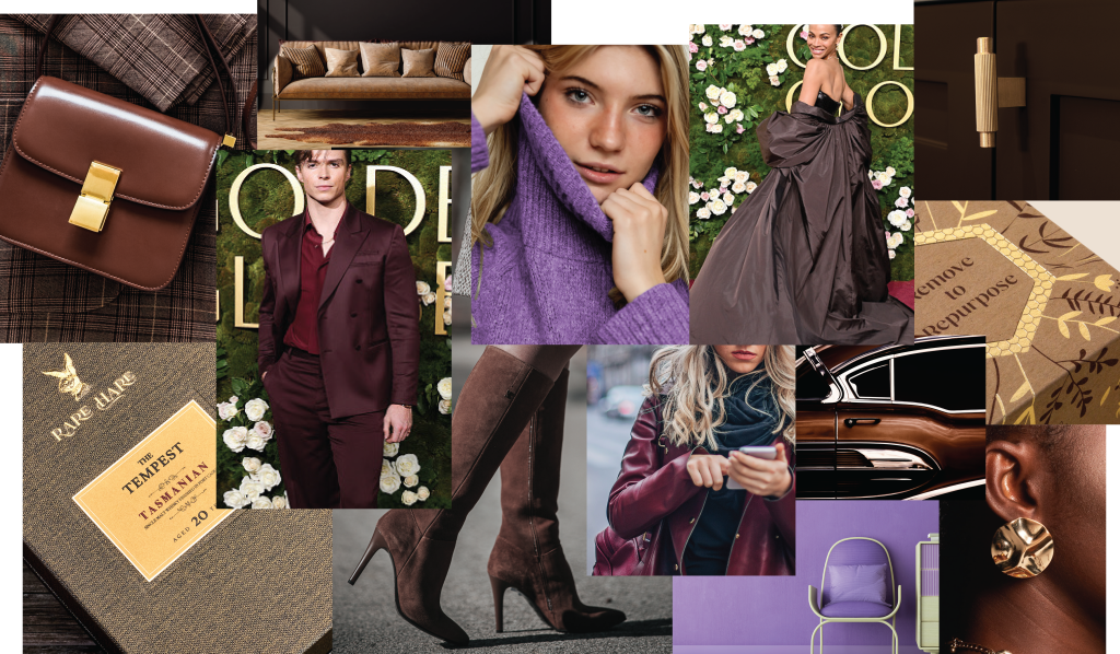
<br><br>Versatility: Use each paper individually for an eye-catching, impactful look, or combine several for a dynamic, multidimensional effect.
Sophistication: These colors and textures have the power to elevate brands, packaging, and other print projects with a sense of modern refinement.
Sustainability: Thoughtfully designed with eco-conscious creators in mind, our Color Capsule reflects our commitment to sustainable innovation. All colors are FSC® certified*.
Your Palette, Your Story
<br>The freedom to explore color is a powerful tool for every designer. With the Neenah Color Capsule 2025, we invite you to experiment, push boundaries, and tell your brand’s story in ways that resonate deeply with your audience.
Neenah is proud to lead the way in inspiring design through creative innovation. Whether you’re crafting the next big campaign, developing brand materials, or creating an unforgettable unboxing experience, our Color Capsule is your starting point for extraordinary results.
*FSC C011397
Neenah recently partnered with Artifact Uprising to develop a premium, uncoated paper that would work with new digital foil technology. During
Read MORENeenah recently partnered with Artifact Uprising to develop a premium, uncoated paper that would work with new digital foil technology. During this process, we got to know them a little better and had the opportunity to speak with them about their history, their mission, and the evolving trends in the photo space.
NEENAH PAPER: Tell us a little about the origins of Artifact Uprising. How long have you been in business and how have you evolved?
ARTIFACT UPRISING: The company was founded in 2012 with the mission to inspire people to “tell their stories in meaningful ways.” Our name “Artifact Uprising,” reflects our commitment to creating meaningful artifacts from digital images with the idea that the things we create should have a sense of purpose and significance. Tangible photo sharing is the heart of our business, and we strive to create joy. As the world has gone digital, we help people make permanence of what matters most.
Since our founding, our product lines have expanded from books to include a wide range of photo-related products; everything from wedding albums and baby books to calendars and holiday cards, and more. This expansion allows customers to create a broader variety of personalized photo products that tell their stories, their way.
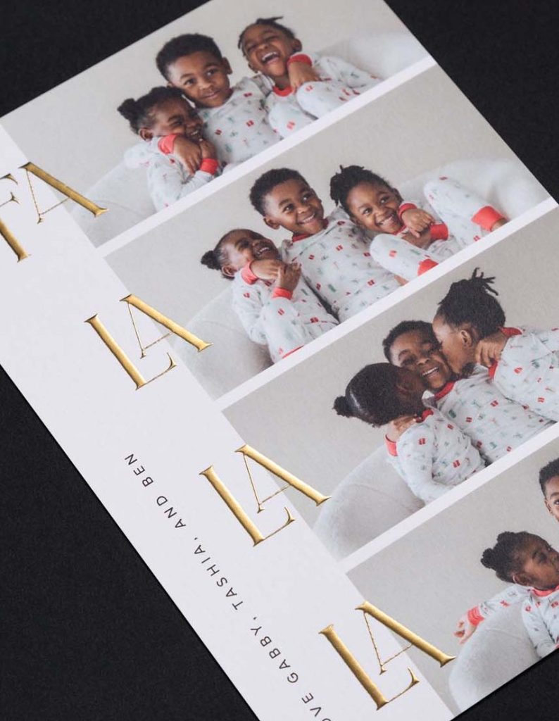
NEENAH: When it comes to photo greeting cards, the trend seems to have shifted to uncoated paper. What would you say is the biggest driver of that trend?
ARTIFACT UPRISING: Uncoated paper has a natural, tactile quality that is very appealing. Paired with the rich, four-color reproduction now attainable on uncoated paper, there’s a warmth and beauty to the final product that just feels more personal than traditional coated paper. It truly stands apart.
NEENAH: How does paper affect the way a card is perceived?
ARTIFACT UPRISING: The physical touch of the paper plays a pivotal role in shaping the perception of quality. During the holidays when you are receiving loads of holiday cards, catalogs, and other things in the mail, our customers want to stand out and make an impression. They want to represent their family or year in review in the best way possible. Having a nice, heavy-weight, uncoated paper with the customer’s chosen photo(s) and a glimmer of custom foil creates a pause with the recipient. It really helps the card stand out from the ordinary.

NEENAH: What are the most important aspects of the paper, from your perspective?
ARTIFACT UPRISING: For us, it’s all about quality, runnability, and customer satisfaction. We prefer an uncoated surface that is premium and elegant which will make the photos look great. Another key factor we look for in our paper products is digital compatibility, allowing us to offer the highest level of personalization. A bonus when using uncoated paper, especially for stationary or photo cards, is that it’s writable so customers can add their own handwritten notes.
NEENAH: We are crushing on your new 2023 Holiday designs! The digital foil looks amazing! This is truly innovative on uncoated paper. What was entailed in getting this to work?
ARTIFACT UPRISING: We started this journey over a year ago to find a premium, quality uncoated paper that would allow for foil customization. Everything we were sampling and seeing across the industry was printing on glossy paper, an aesthetic that Artifact Uprising stays away from. Our design-forward mindset really put us on a path of figuring out how we could make this happen and stay within our own design eye, and Neenah helped by creating a unique product that fits this need. We strive to continually provide new products and features that surprise and delight our customers, and this paper is a big part of that!
NEENAH: What are the advantages of digital foil vs. traditional foil in your space?
ARTIFACT UPRISING: The biggest advantage is being able to offer the customer an additional way to customize and enhance their cards. In order to provide relatively quick production on a time-sensitive holiday card, we previously only had the option to use static traditional heat-pressed foil to allow for batching. Digital foil allows a customer to bring an elevated effect to their card by including their own personalization in beautiful foil.
NEENAH: Any other comments about the paper, digital foil, process, or 2023 offering?
ARTIFACT UPRISING: We are excited to see how this new offering resonates with our customers this holiday season. We believe this additional level of quality and personalization is going to take our holiday card line to the next level. Thank you to Neenah for allowing us to partner and innovate with them.
Hello Bartlett Brands! Tell us a little about yourselves. We are an all-female creative innovation agency that develops and launches
Read MORE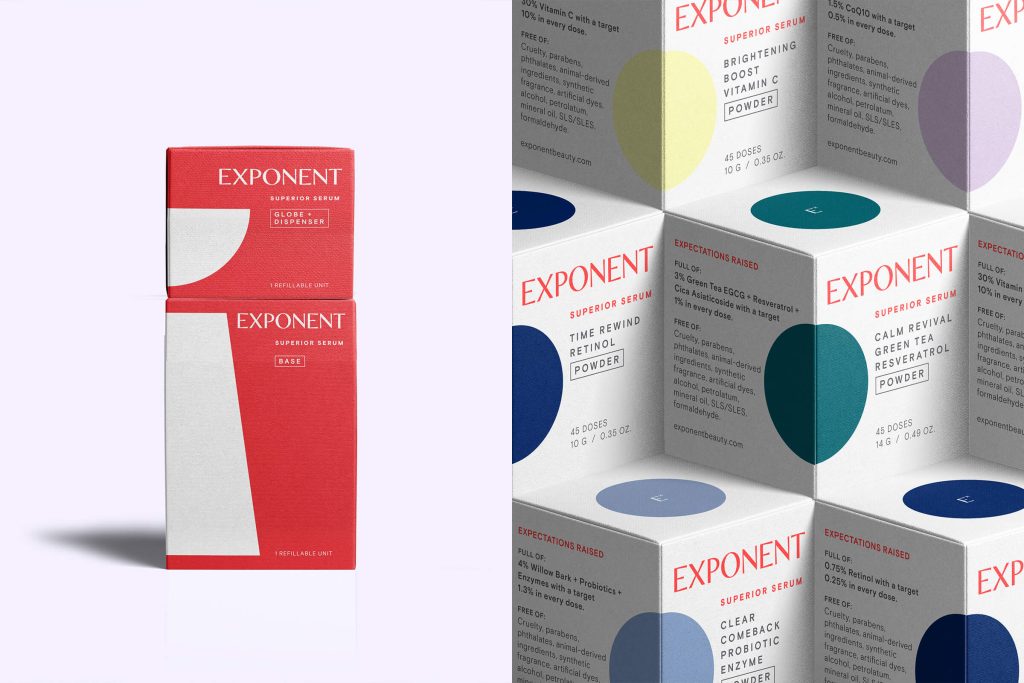
Hello Bartlett Brands! Tell us a little about yourselves.
We are an all-female creative innovation agency that develops and launches forward-thinking, culturally-relevant consumer brands. We challenge the status and cut through the quo with smart strategy, stylish storytelling, and sustainable design. Often, we create something from nothing.
NEENAH: Challenging the status and cutting through the quo. We love that! And sustainable design always gets our attention. Perusing through some of your work, we’ve noticed a fair amount is in beauty – is that your specialty?
Because we have several beauty industry vets on the team, we often find ourselves working in parallel categories like health & wellness and personal care—often with brands and products targeted towards women. We are dedicated to banishing outdated narratives, stale marketing clichés, and cultural taboos as it relates to these evolving categories. And we love to work with any consumer brands that want to be at the forefront of sustainable innovation.
NEENAH: Do you typically work with start-ups or established brands?
We work with mostly early-stage companies prior to launch—as well as some established brands in need of a radical refresh. Generally, our clients are at a financial inflection point, either they have just raised their first round and are ready to invest in branding—or they have traction and need fine-tuning to get to the next level.
NEENAH: The Exponent primary packaging is such a unique and innovative idea! At what stage in the project did Exponent come to you for help?
We were involved in the beginning. The team came to us with their incredible product and initial packaging ideas. In addition to conducting consumer research, brand strategy, brand naming, identity, and storytelling—we have worked tirelessly on the packaging approach and design. Newness and innovation are very challenging for consumers. We also did all the copywriting, web design, photography, video, and some digital marketing.
NEENAH: Did you have any input in the primary packaging, or was that already established?
Yes, we worked alongside the industrial designers at Tomorrow Lab and the manufacturers at Wormser Group to perfect and evolve the primary packaging system, both functionally and aesthetically. Our patented Activator Packaging System was a huge lift in form, function, and sustainability. We worked on it over the course of 3 years to get it right.
NEENAH: Can you explain how it works?
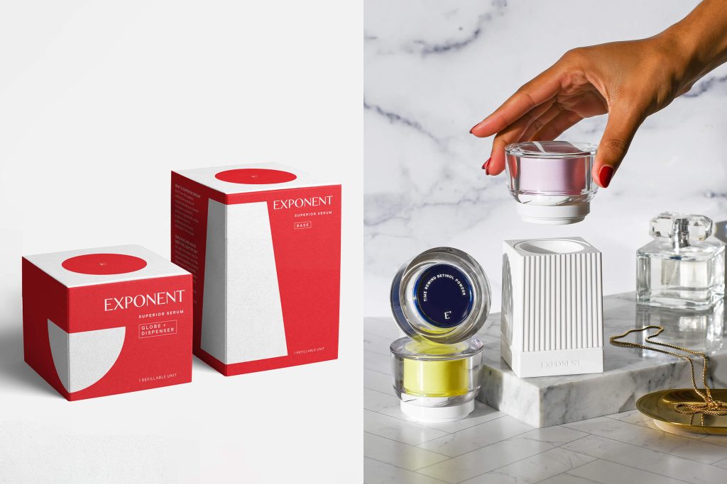
Functionally, the Activator is essentially a sexy dispenser that works like a lock & key: You place the Powder Globe onto the Hydrator Base and simultaneously push in while you twist. This action precisely doses the optimal amount of Active Powder from the top Globe while up-pumping the Hydrator from the Base. The consumer mixes for about 8 seconds before applying. The precision dosing of powders is no easy task– it’s usually done with single-use disposable packaging solutions in the pharma industry. There are 22 components in our Activator and Exponent holds utility and design patents on it.
NEENAH: That is fascinating! It sounds so mechanical, yet it looks so beautiful.
For deco and form, we knew that beyond being functional packaging, we wanted to bring beauty and luxury into the packaging design. We drew inspiration from the vintage fragrance bottles our Founder remembered seeing on her grandmother, Elsie’s, boudoir. Our white column-like fluted Hydrator Base has an almost sculptural quality while our Lucite Globes and Powder Dispensers illuminate and refract the bold, color palette of our various Active Powder Jars.
NEENAH: What was the most challenging part of this branding project?
As designers and innovators, it is our responsibility to make the most sustainable decisions when creating new and complex packaging. There were two main challenges to tackle with this new innovative design. 1. Appealing to consumers in a way that made it easy to change their typical skincare behavior, and 2. Creating a streamlined refillable packaging system that minimizes materials & landfill waste—without adding complexity or compromising product performance.
NEENAH: How important was it to incorporate sustainability into this project?
It was a priority from the start! One of our goals was to eliminate plastic waste, which led to the invention of a refillable system. Our system is designed to be reused over and over, while our Powder and Hydrator Refills come in infinitely recyclable glass with aluminum caps. In addition, our unit cartons are made from 100% post-consumer waste papers. For its achievement in eliminating plastic waste, Exponent achieved B Corp certification prior to launch.
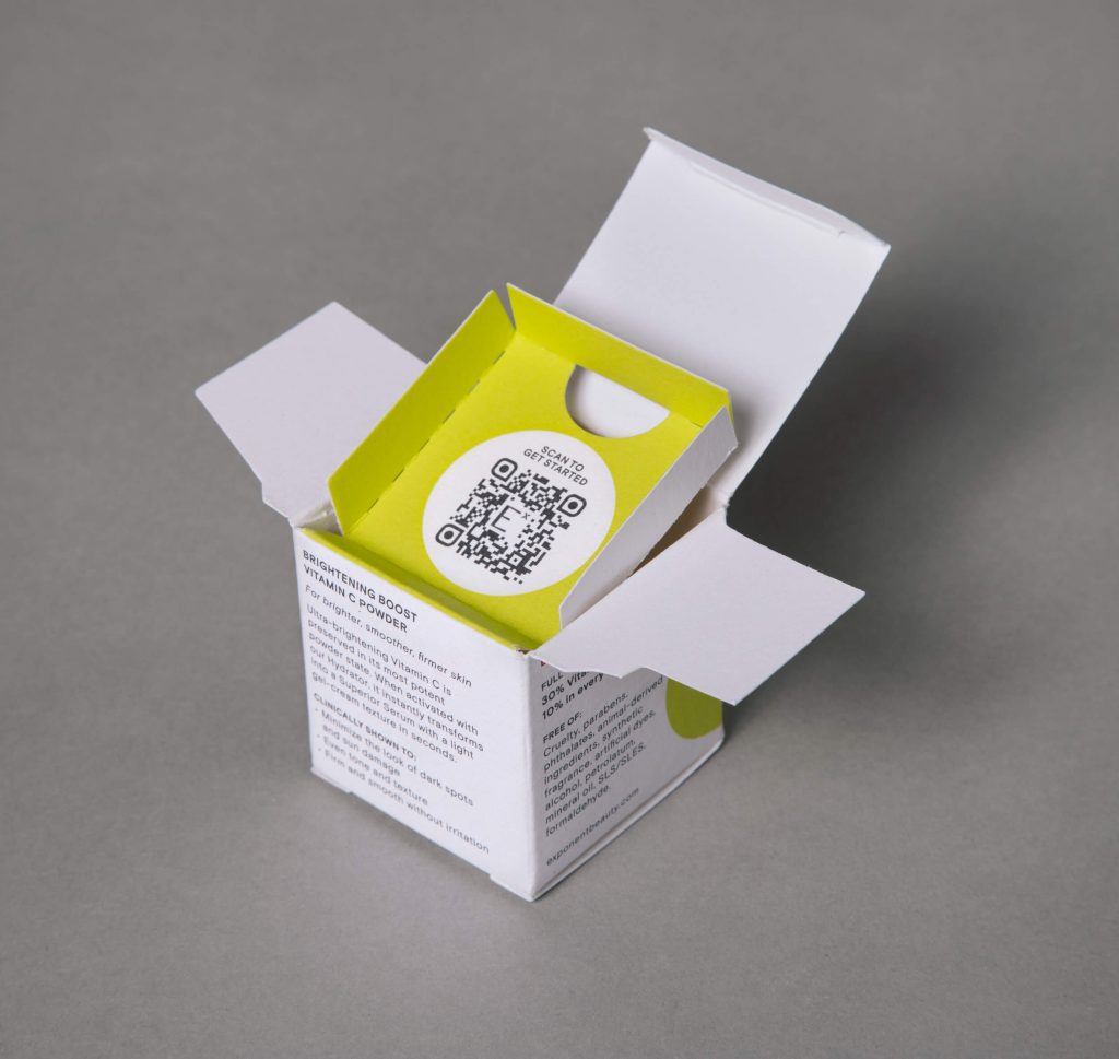
NEENAH: When it came to the carton design, were you looking specifically for 100% post-consumer waste?
Sustainability is extremely important to us as an agency – we’ve been thought-leaders on the topic since before it was trendy—which is why we always challenge our brands to make the best choices. Exponent didn’t need any convincing, we were aligned from the start that the brand is luxury with a conscience, and we loved the sophisticated look of the NEENAH® Folding Board. We’ve long been admirers of Neenah paper and were excited when our printer partner presented it as an option.
NEENAH: The packaging for the base and globe + dispenser have a different look than the refills. Explain the color decisions.
The Base and the Globe + Dispenser pieces are meant to be used over and over again, so we distinguished them with a flood of red. The product refills have a flood of white with pops of color that speak to product benefits.
NEENAH: How is the product selling?
Exponent Beauty launched about a year ago and has quickly become a cult breakout brand surpassing revenue expectations. It has grown rapidly through organic acquisition, with extensive press coverage, social UGC, rave customer reviews, and unusually strong repeat purchases.
NEENAH: Can you attribute sales success to branding and packaging?
We think so! Exponent customers and press editors have given glowing testimonials, speaking to the dramatic results they experience, as well as the counter-worthy design and sustainability measures.
a Mativ Brand
